

About
GetFit is a fitness and nutrition responsive web application helping users to connect with experts from different fields who help and guide them to achieve their goals through a variety of different methods.
Goals & Objectives
Create a responsive web application by using the mobile first approach to help people connect with fitness and nutrition experts. This app was created for the UX course at Careerfoundry.
Role
Sole UX/ UI Designer, working from conception and research to visual and testing
Duration
June 2020 - October 2020
Tools
Adobe: Illustrator & XD
UsabilityHub, Pen & Paper, Optimal Workshop
The Design Process
Problem Statement
Fitness app users need a way to easily get advice from an expert quickly to determine the best fitness and nutrition routine for them according to their demands, goals and motivations.
Competitor Analysis
Gymondo
Gymondo is a fresh und upcoming app which has a very modern design and focuses primarily on workouts and help people achieve their goals. They have a range of workouts and keep a simple yet colourful design in order to engage the users.
myfitnesspal
Myfitnesspal is one of the most popular web based fitness tracking app. It has a simple approach and easy to track goals and daily food intake alongside exercise. It has many different lists in order to make the addition of information very easy and straightforward and its UI is very simple to keep it minimal throughout.
User Surveys
I created a user survey in order to find out more about what users would want to see in a fitness and nutrition app. The survey was created in Crowdsignal and data of 18 participants was collected.
Most people who are into fitness and nutrition are between 25-30 years of age
Most people spend roughly 2-4 hours per week on fitness
The majority of people want to be healthy and lead a balanced lifestyle in comparison only a few people really want to get in shape or certainly loose weight.
Most Participants are overall average in their fitness level.
Most people believe that at some point they need some expert advice to help them to achieve their goals.
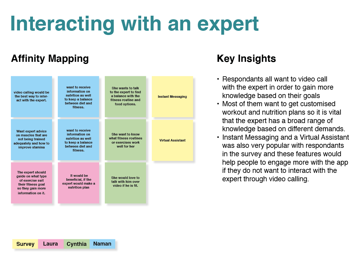
Video calling and instant messaging are the most popular ways people would like to interact with an expert
The main problem participants encounter while doing their fitness is that they are not regular which is very important for our app to know so we can find a potential solution for this problem.
Alongside the expert interaction feature people mostly look for a way to stay motivated through daily challenges and motivational quotes.
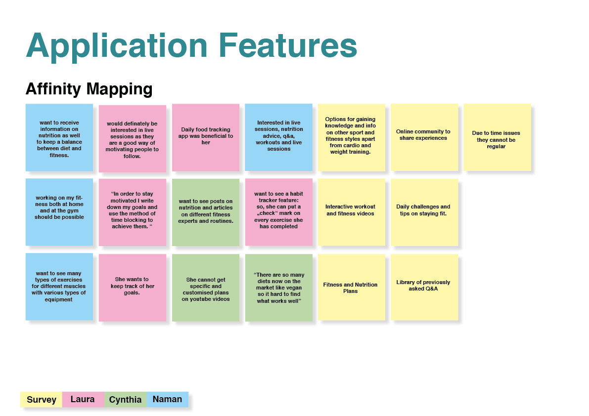
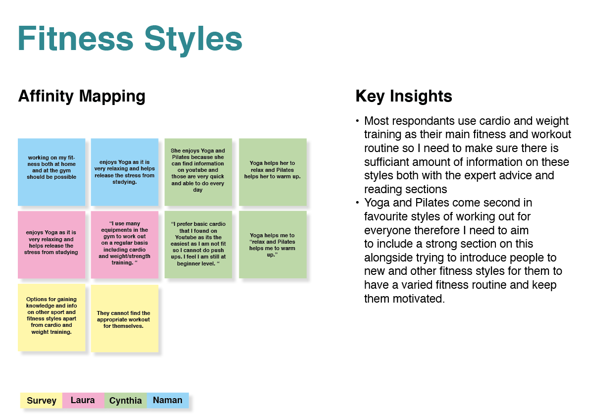
User Interviews
Further I conducted user interviews with 3 participants to gain insights into their goals and motivations about fitness and nutrition.
From the information I created affinity maps for participants.
Key Insights
Participants all had different goals and reasons for doing fitness and their approach towards it was quite different as well.
The interviews helped me outline what their definition of fitness it and how they try to maintain it with their daily routine
I understood the reasons why people would connect with an expert and what kind of queries would be most popularly asked to them which will help me determine but not be limited to how I have to choose the experts for the app
I could determine what information the users want to have about the expert in order to find the suitable expert to connect with which is a key feature I need to develop on in my app
The interview gave me a small insight into what other features people want to have in the app apart from just the expert conversation feature
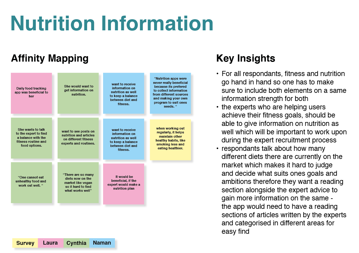
Since I was trying to figure out how much importance to give to the nutrition part on my app, but the interviews helped me determine that it is vital to be included in a large way in my app since for almost everyone fitness and nutrition go hand in hand.
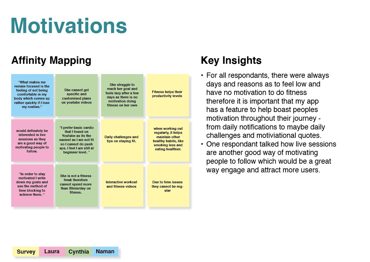
I understood what kind of fitness routines people are interested in apart from the known cardio and also how much time they can invest in fitness which will help in finding and creating workouts on my app to suit every persons demands.
I further created more affinity maps for different categories that can be seen below


User Personas
Using the information from my surveys and interviews I created 3 user personas, all having different goals and motivations in mind
User Flows
Using the information from the user personas I created 3 user flows which matched to each one of the users motive and goals.
User Journey Maps
To dig deeper into the user profiles I created user journey maps to understand their problems for creating effective solutions.
Sitemap
Sitemap 1.0
I created sitemap based on my user flows, personas and keeping the problem statement in mind. I made sure to include all sections that needed to be included in my app.
Sitemap 2.0
By conducting a card sorting analysis with 9 participants I reworked by sitemap to simplify it more and this was then my final sitemap.
Low Fidelity Wireframes
I started off my iteration process through sketching out some basic wireframes using pen and paper in order to get a basic layout ready for my design.
Below are a few examples of my low fidelity wireframes.
Mid- Fidelity Wireframes
Using the low- fidelity wireframes I created mid- fidelity wireframes for all my user flows.
Below are a few examples of my mid- fidelity wireframes.
High- Fidelity Wireframes & Prototype - Grayscale
In order to conduct usability tests I created high - fidelity grayscale wireframes and prototype.
Usability Testing
I conducted usability tests with 6 participants in order to find out if there were any issues or problem that needed to be fixed before moving ahead in the design stage.
From the test results I first created affinity maps in order to arrange the information into categories.
Using the affinity map I created rainbow spreadsheets in order to categorise my findings and test results into different rankings and determine which were a bigger problem vs. findings which were more of cosmetic fixes or ideas.
Iteration based on Usability Test Feedback
Other Small Changes made
URL Bar on top removed giving more space on screen page as this would be preincluded when opening the application
Reducing icons on top on user profile since they were double - also reduced overall since profile link is in bottom nav as well
Calendar added for people to track their appointments
Username was not same throughout which has been fixed
Expert Profile viewing was made more readable
Personal bests added on demand by participants to see and track their goals
Tab bar option used to have workout guide as well
Issue 1
Problem: When Clicking T&C agreement on sign up profile, there is no tick appearing and doesn’t let user go further - commented by 2/6 participants
Solution: Make tick box active and if it doesnt work add an error message. Recheck prototype linking
Issue 2
Problem: Participants did not understand how they would calculate the calories and time during workouts and this should be shown by the app
Solution: Add a progressive calorie counter and time tracking within the video during workout and remove this question during the feedback
Issue 3
Problem: Participants did not want to apply all filters during search and asked for a option to apply certain filter only.
Solution: Add a button after every filter to apply filter and lead the user to the filtered results based on their information.
Issue 4
Problem: Fitness and nutrition on top for expert search was not clear to be filter
Solution: Add a button for both expertise on top and based on the choosen expertise the remaining filters would open in this case for fitness
Issue 5
Problem: Participants wanted to have a calender feature to be added in expert profile to know in advance when they are available
Solution: Add calender option within the expert profile for which the expert profile layout has been changed to accomodate the large amount of info
Visual Design
In order to create effective UI for my application I took preference tests, design collaboration and accessibility factors into consideration to create my final design.
Preference Test
In order to finalise my colour palette for my app I created a preference test using UsabilityHub and managed to get a clear winning colour palette which was the right one.
Design Collaboration
In this stage I shared my design with other UX designers and got some good and positive reviews on my applications and a few ideas which I could improve to make my design more better.
Accessibility
I once again looked over my design and reworked on elements like colour contrast, text size and information readability in order for the design to work for all age groups and any person without being restricted.
Final Design
Design Language System
To sum up and organise all my visuals for the application I created a design language system file.
Final Prototype and Prototype Presentation

Project retrospective
What went well?
1. The overall process of competitive analysis, creating user personas and conducting user research went well.
Skills:
Research skills, ability to analyse, interviewing skills, listening skills and presentation skills for creating analysis reports
Process:
Downloading and trying out competitor apps
Researching and reading reviews about competitor apps
Analysing research from competitors and user surveys
alongside user interviews to create user personas.
2. Creating and testing my wireframes throughout the design process allowed me to make changes in the prototype
Skills:
Usability testings, wireframing, rapid prototyping, iterative design
Process:
Creating low, mid and high fi delity prototypes based on
user centered design and taking the user feedback into
consideration in order to constantly improve the design.
What did not go well?
1. I did not create a guide at the beginning for different buttons and text sizes therefore it was hard to keep all design element same size and layout style throughout the app
Skills:
Adobe XD, creating a styleguide
Process:
creating all style systems based on own experience rather than a strict styleguide and specified sizes
Skills Gap:
Setting up font styles, button sizes, layout grids and UI element for colour balance
Solution:
Review Adobe XD tutorials and Material Design specifications and create styleguides at the beginning of mid-fidelity wireframes
What can be improved?
1. Work on my Adobe XD skills in order to create wireframes and prototypes faster and make changes more quickly.
Skills:
Adobe XD, wireframes, prototyping'
Process:
Use industry standard tool to create prototypes and wireframes
Skills Gap:
Adobe XD
Solution:
Watch more tutorials and live sessions on Adobe XD and work on side projects like Daily UI challenge to enhance these skills
2. I spent too long looking for images for experts and also photographs at very early stage for rapid prototype and therefore had to rush with animating and prototyping
Skills:
Adobe XD, attention for detail
Process:
Polishing designs, prioritising quality
Skills Gap:
Time Management
Solution:
Focus on basic functionality first and create time blockers in order to manage time for each element equally.
2. Work on research and interview skills to get more information
Skills:
research, interviewing, analysis
Process:
Take more time out to research into different paths and then narrowing it down
Skills Gap:
research and analysis
Solution:
Take more time out to research thoroughly by creating a structured time plan for each design and projectstage